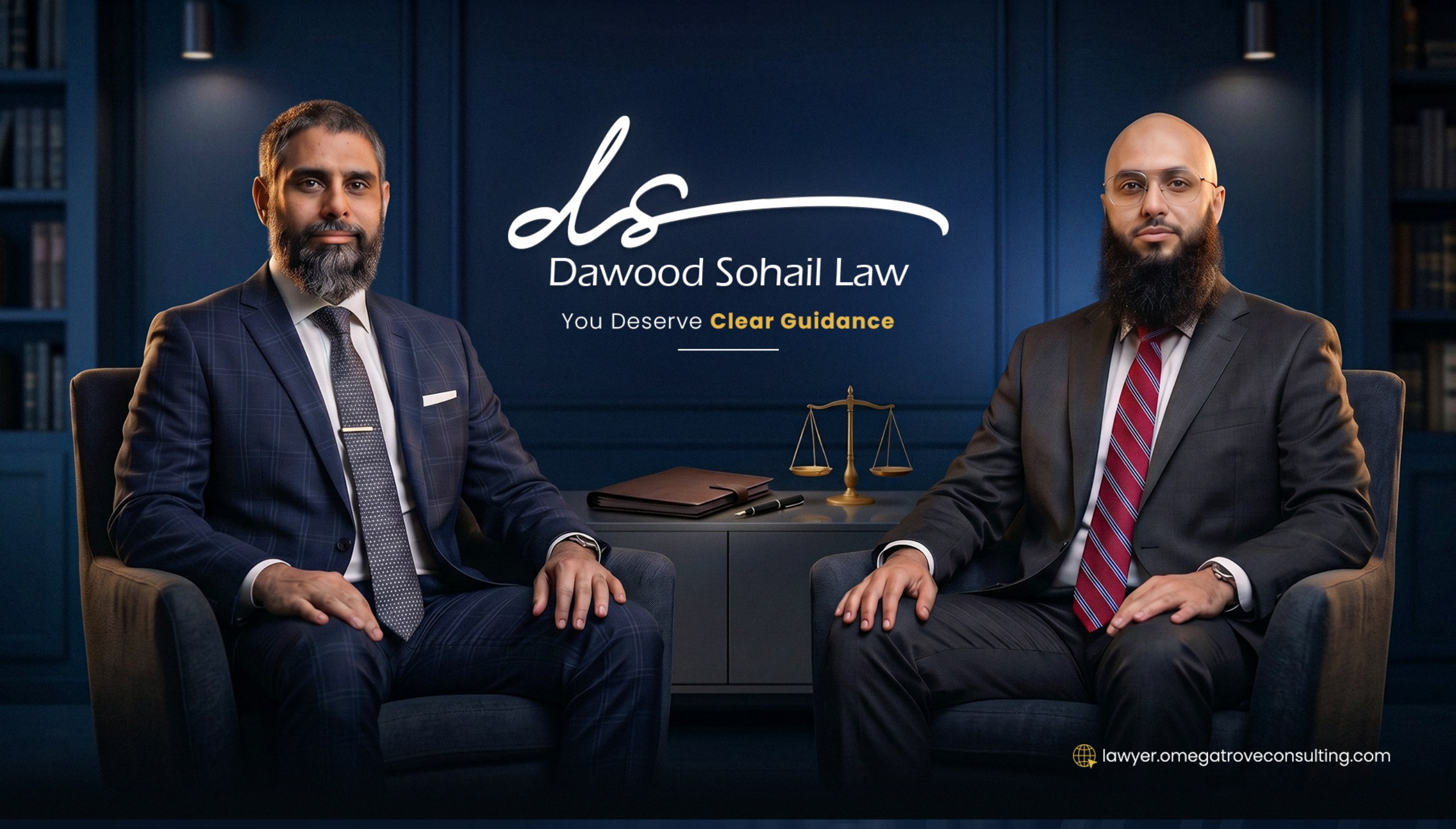
A trustworthy identity for an Orlando law firm that puts clients first.
Omega Trove partnered with Dawood Sohail Law, a trusted law firm in Orlando, Florida, to build a complete brand identity — and website — from the ground up.
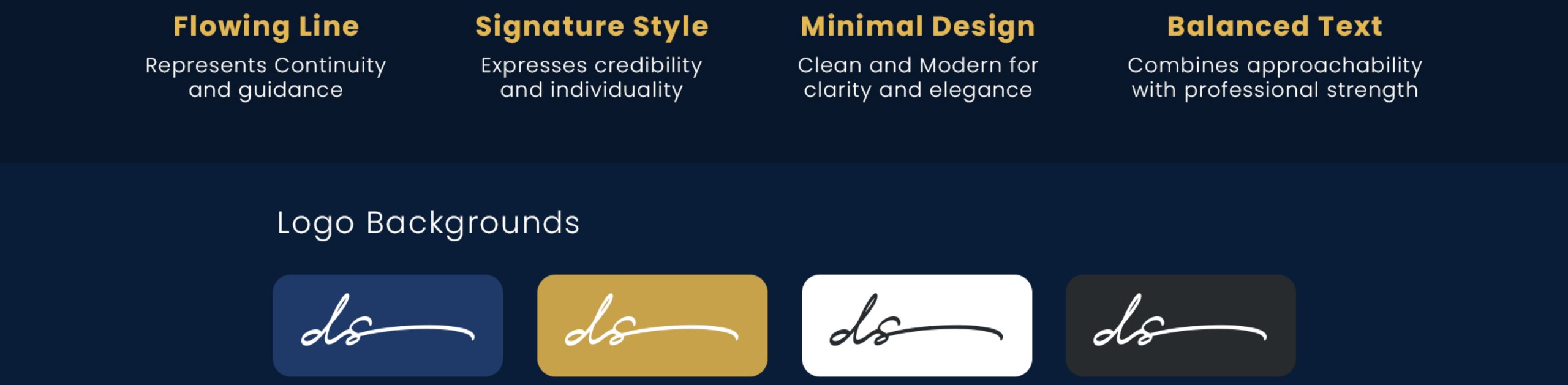
We crafted the full system — a flowing signature-style “ds” logo, a navy-and-gold palette built for trust and prestige, and a clean Montserrat typographic voice — translating credibility, clarity, and approachable authority into one confident visual language.
The identity runs on one promise: “You Deserve Clear Guidance.” — carried across business cards, letterhead and presentation folders, branded pens, and a client-focused website built to introduce the attorneys and the people they represent.
From stationery to the screen, Dawood Sohail Law now looks the part it plays — a modern, trustworthy Orlando firm where clients feel guided from the first click.
Dawood Sohail came to us running a real Orlando law practice that covered business law, wills and trusts, immigration, and…
Dawood Sohail came to us running a real Orlando law practice that covered business law, wills and trusts, immigration, and business contracts, with a website that read like a template someone bought on a Friday afternoon. The old site called the firm "Business Law | Wills and Trusts Experts," and the copy underneath was thin enough that a prospect couldn't tell what kind of client the firm actually served or why they should trust it with a case that mattered. For a professional-services business, that's the whole ballgame. When someone is searching for an attorney at 11pm because a contract dispute just landed on their desk, the first thirty seconds of your site decide whether they call you or the firm ranked below you. Dawood's practice deserved a presentation that matched the calibre of work he was already doing for clients.
We treated this as a full identity build rather than a facelift, because the existing marks and copy had nothing worth…
We treated this as a full identity build rather than a facelift, because the existing marks and copy had nothing worth preserving. First step was sitting with Dawood to figure out what the firm actually is: not a bargain generalist, but a modern Orlando practice built on giving clients clear guidance in high-stakes moments. That framing became the whole brand. From there we ran brand identity and web design in parallel, so the visual system and the site copy could inform each other. Navy and gold read as prestige without turning into the same tired lawyer template. A flowing signature-style "ds" monogram gave the firm a mark that would still look right on stationery, a folder, or a courthouse sign in ten years. Montserrat set the typographic voice: clean, modern, not the fake-serif nostalgia most law firms default to.
The brand system and static site went live in early July 2026. That includes the logo, letter construction, color palette,…
The brand system and static site went live in early July 2026. That includes the logo, letter construction, color palette, typography guidelines, business cards, letterhead, presentation folders, branded pens, and a client-focused website built around the promise "You Deserve Clear Guidance." The site's structure introduces the attorneys, the practice areas, and the kind of client the firm represents, so a prospect landing from a Google search can qualify themselves in under a minute. The on-page SEO pass is underway now: metadata, entity clarity, schema, content depth on each practice-area page, and internal linking between related pieces. Content buildout follows: FAQ blocks, plain-English explainers of common questions on business contracts and estate planning, and location signals so the firm is legible to Orlando-area search. The point isn't to stuff pages with keywords. The point is that when a business owner types "Orlando business contract attorney" into Google or asks ChatGPT the same question, the site is written in a way both channels can cite.
The mark itself is the detail worth calling out. Most law-firm logos default to a shield, a column, or two initials in a serif.…
The mark itself is the detail worth calling out. Most law-firm logos default to a shield, a column, or two initials in a serif. We built Dawood's monogram as a single flowing signature, closer to how an attorney signs a contract than how a corporation stamps a folder. It reads as a person, not a firm. That decision propagates through the whole system: the letterhead treats the mark like a signed guarantee, the folders carry it as a seal, and the site uses it as a quiet trust cue rather than a shouting logo lockup.
Engagement in progress. The brand and static site shipped on schedule, and the firm now has a visual and verbal presentation that…
Engagement in progress. The brand and static site shipped on schedule, and the firm now has a visual and verbal presentation that matches the level of practice Dawood runs day to day. The on-page SEO, content, and AI-visibility phases are actively being built out. Target outcomes for the next quarter: rank for Orlando business-law and estate-planning queries the firm actually wants to be found for, get cited by AI answer engines when someone asks a related question, and give Dawood a site that converts the traffic once it arrives. We'll update this page with real numbers once we have a fair post-launch window to measure.


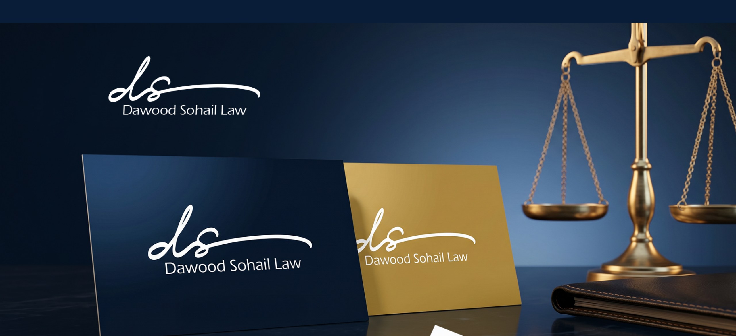
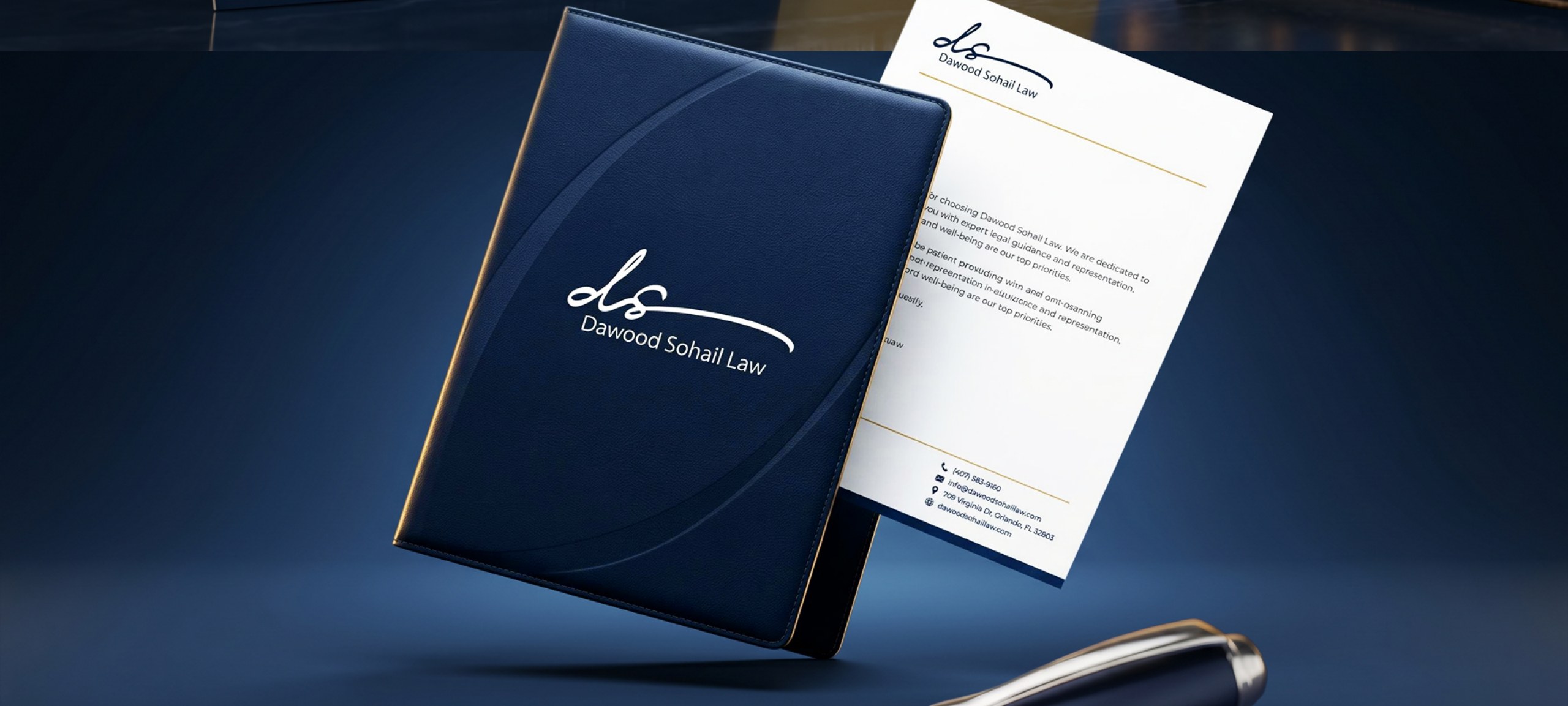
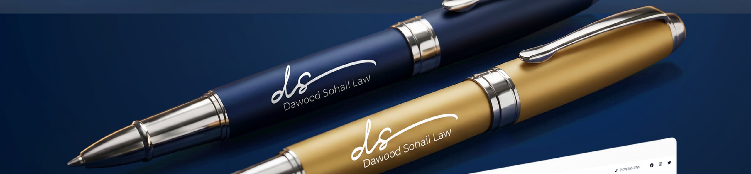
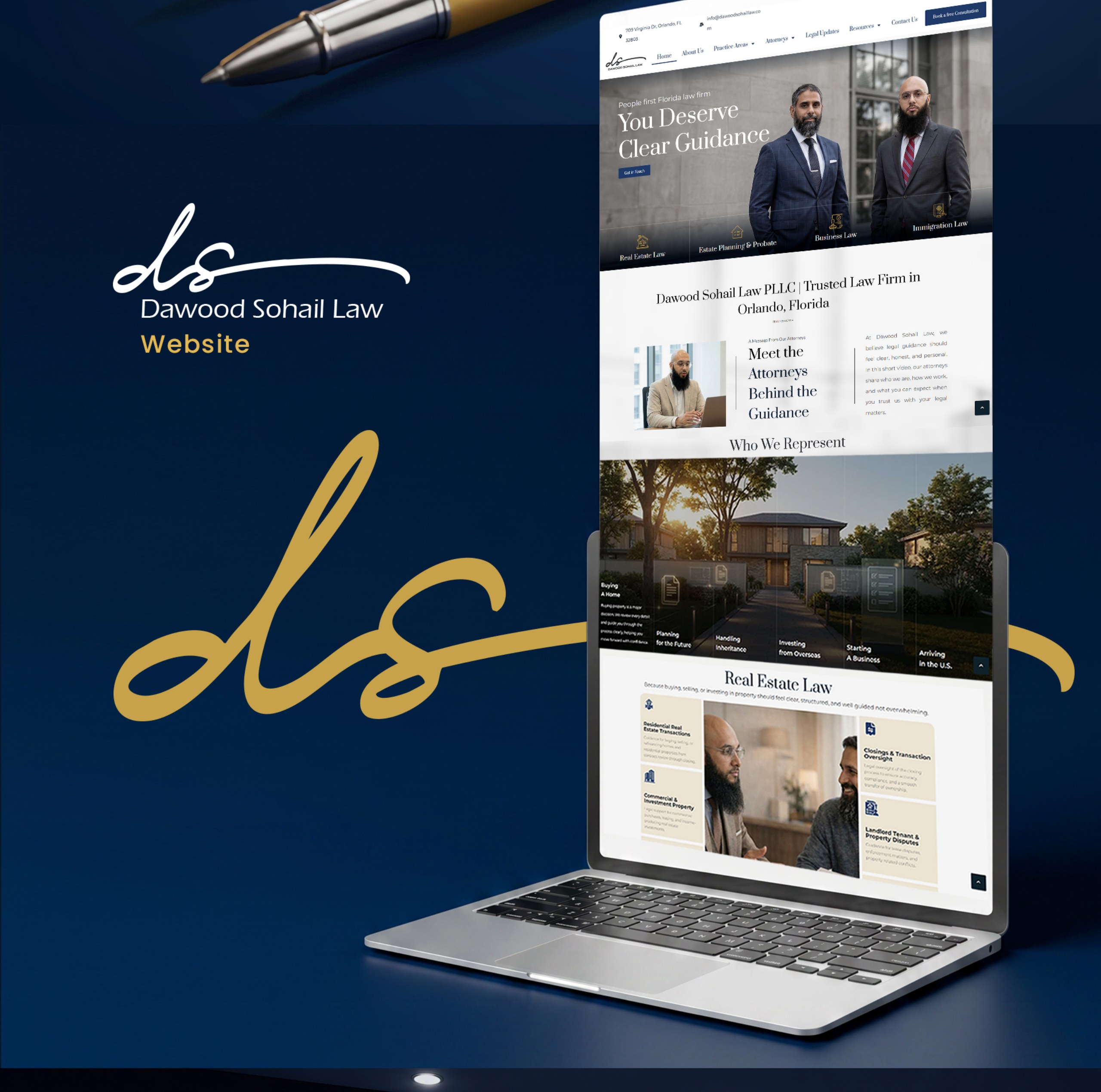
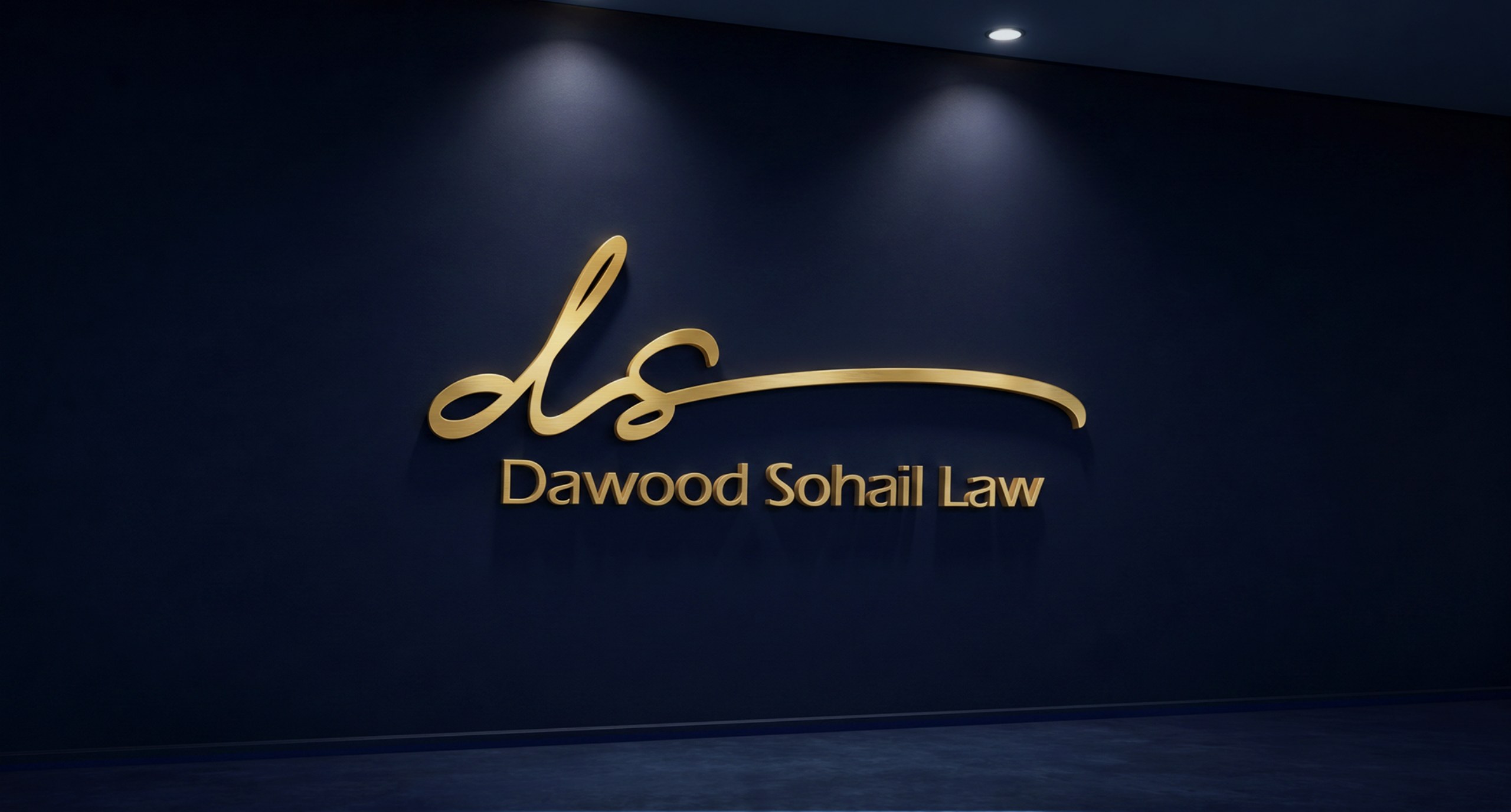
A complete brand identity and website from the ground up — a flowing signature-style “ds” logo, a navy-and-gold palette, Montserrat typography, business cards, letterhead and presentation folders, branded pens, and a client-focused website.
Dawood Sohail Law is a trusted law firm in Orlando, Florida — its brand is built around the promise “You Deserve Clear Guidance.”
Omega Trove Consulting, a Winter Park, FL branding and digital marketing agency serving Orlando and Central Florida, built the identity and website from the ground up.
Tell us about your business — the first consultation is free.
Book a free consultation →Call (407) 978-6811