What Is Responsive Web Design in Web Development?
Responsive Web Design is a web development approach that allows websites to adapt seamlessly to different screen sizes, devices, and orientations. It ensures content looks professional and functions correctly whether viewed on desktop, tablet, or mobile. At Omega Trove, Responsive Web Design is central to creating digital experiences that build trust and drive growth.
Responsive Web Design makes websites flexible by using fluid grids, scalable images, and CSS media queries. This approach reduces the need for separate mobile and desktop sites, improves usability, and supports Google’s mobile-first ranking standards.
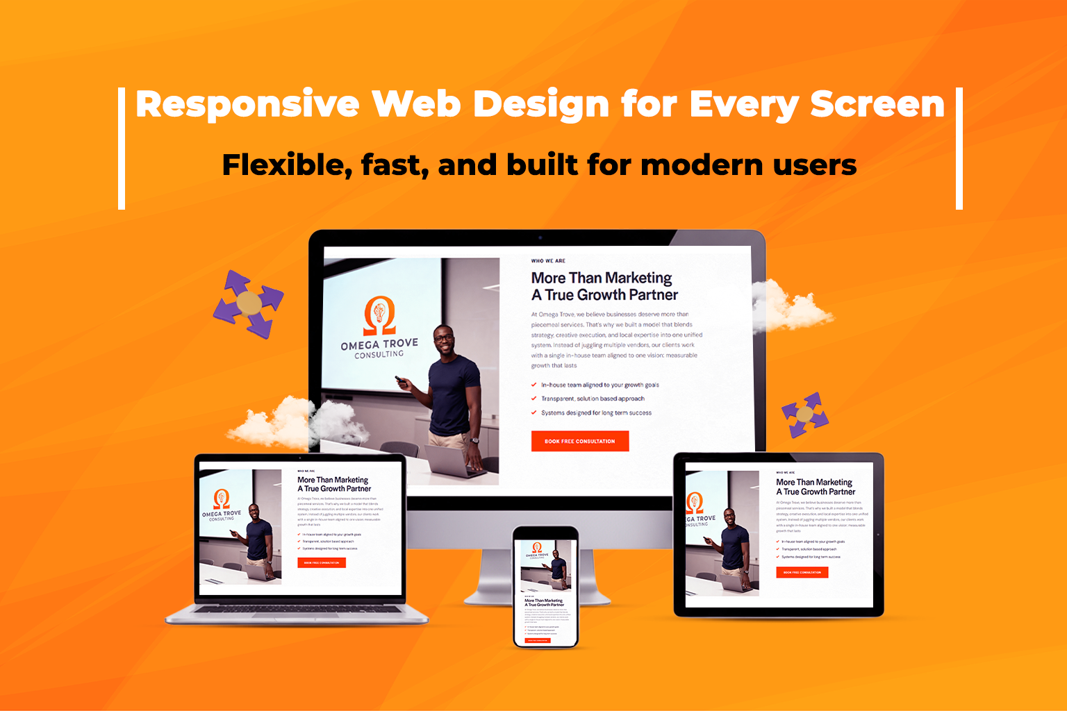
What Does Responsive Web Design Mean in Web Design & Development?
In web design, Responsive Web Design means your website automatically adjusts its layout for the user’s device. For example:
- On desktops, a product grid may display in four columns.
- On mobile, that same grid collapses into one scrollable column.
For consulting agencies like Omega Trove, responsiveness isn’t just a technical detail — it’s a business enabler. A responsive site ensures that Central Florida businesses with storefronts, online shops, or service areas deliver consistent customer experiences across every screen.
Why Responsive Web Design Matters for Business Strategy
Responsive design is more than aesthetics — it’s about accessibility, performance, and customer engagement.
Benefits of Responsive Web Design:
- Builds credibility with professional, modern layouts
- Improves SEO rankings via mobile-first optimization
- Reduces bounce rates and increases session time
- Supports accessibility and inclusivity
- Cuts costs by maintaining one adaptive site instead of multiple versions
For local businesses, startups, and e-commerce brands, these benefits translate into more visibility, more clicks, and more conversions.
How Omega Trove Applies Responsive Web Design
Omega Trove’s process blends craftsmanship, clarity, and scalability — three of our brand pillars:
- Mobile-First Frameworks: We design for phones first, then scale up for larger screens.
- CSS Grid & Flexbox: Adaptive layouts that adjust gracefully.
- Speed Optimization: Compressed images and lightweight code for fast load times.
- Cross-Device Testing: Rigorous checks across browsers and screen sizes.
- Accessible Design: ADA-friendly layouts with proper color contrast and text scaling.
Learn more about our Web Design & Development services.
Related Terms You Should Know
- Mobile-First Design – Designing websites for mobile before scaling up.
- CSS in Web Design – Styling language that makes responsive layouts possible.
- UX (User Experience) – How users interact with and feel about a website.
Frequently Asked Questions
Why Is Responsive Web Design Important?
Responsive Web Design ensures websites look and function properly on all devices — from desktop to mobile. It improves user experience, builds brand credibility, and boosts SEO rankings by meeting Google’s mobile-first indexing standards. A responsive site enhances engagement, conversions, and overall customer satisfaction.
How Does Responsive Web Design Impact SEO?
Responsive design directly supports SEO by ensuring your website meets Google’s mobile-first ranking criteria. Mobile-friendly sites load faster, reduce bounce rates, and create a consistent experience across devices. These factors improve Core Web Vitals scores, which are key signals in modern search engine algorithms.
Can an Old Website Be Made Responsive?
Yes. Existing websites can be retrofitted for responsiveness using modern CSS frameworks like Bootstrap or Tailwind CSS. Developers can restructure layouts with CSS Grid or Flexbox, optimize media queries, and adapt navigation elements — transforming outdated designs into mobile-friendly, future-ready websites.
Is Responsive Web Design Cost-Effective?
Absolutely. Maintaining one adaptive website for all devices saves time and money compared to managing separate desktop and mobile versions. A single responsive site simplifies maintenance, improves performance, and reduces development costs while ensuring consistency in branding and user experience.
How Does Responsive Web Design Improve Conversions?
Responsive design improves conversions by removing friction in the user journey. Mobile-friendly layouts make navigation easier, CTAs more visible, and checkout flows smoother. Studies show that mobile-optimized sites can increase conversions by over 30%, as users are less likely to abandon slow or unresponsive pages.
What Frameworks Are Commonly Used for Responsive Design?
Popular frameworks for responsive web design include:
- Bootstrap – Simplifies mobile-first grid layouts
- Tailwind CSS – Utility-first for custom responsiveness
- Foundation – Robust and scalable for enterprise use
- CSS Grid & Flexbox – Built-in browser tools for adaptive design
These frameworks ensure consistent design across screen sizes.
What’s the Difference Between Responsive and Mobile-First Design?
Responsive design adapts websites to fit all devices, from small to large screens. Mobile-first design begins by designing for the smallest screen and progressively enhancing for larger displays. Both strategies ensure usability, but mobile-first prioritizes performance and accessibility for handheld users.
Does Page Speed Matter in Responsive Design?
Yes. Page speed is crucial to responsive performance and SEO. Fast-loading websites enhance user experience and retention. Techniques like image compression, code minification, browser caching, and Content Delivery Networks (CDNs) ensure quick load times, especially on mobile networks.
How Do Businesses Test Website Responsiveness?
Responsiveness is tested using:
- Browser developer tools and device emulators
- Online testing tools like BrowserStack and Responsive App
- Manual testing on real devices across iOS, Android, and desktop
Testing ensures consistent functionality, layout, and speed across all screen types.
What Industries Benefit Most From Responsive Web Design?
Every industry benefits, but it’s especially critical for:
- E-commerce stores needing smooth mobile checkouts
- Local service businesses targeting on-the-go users
- Corporate and SaaS websites with global audiences
Responsive design ensures accessibility, engagement, and competitive performance for any modern business.